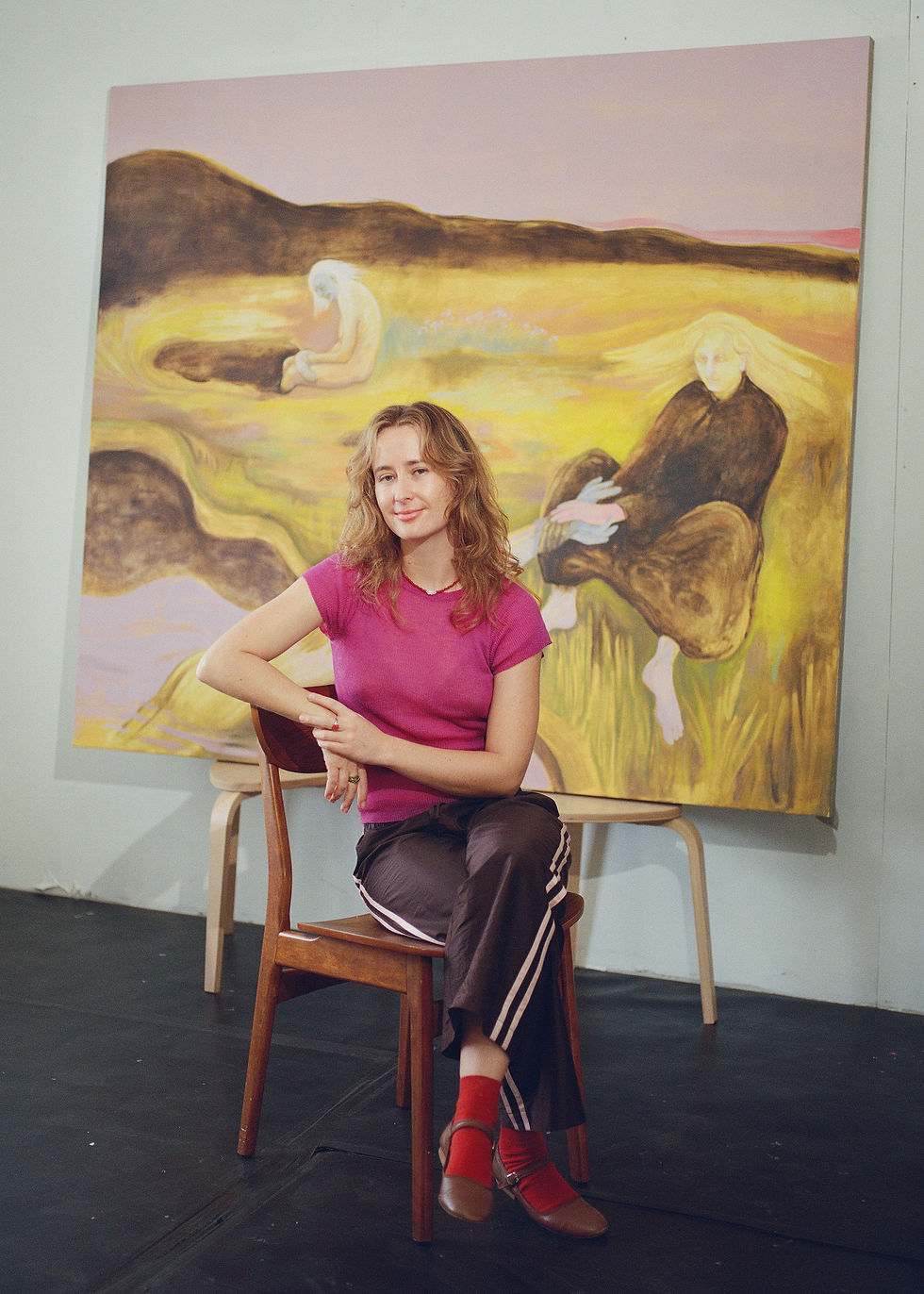
Kasia Davies
- Sep 26, 2025
- 5 min read
Kasia Davies paints sunlit scenes of women spending time together in everyday moments. Her works often start from a place she’s visited or a memory that stuck with her, especially from Mediterranean beaches. In the series “Gossip Girls,” she captures the relaxed energy of friends talking by the sea, using bright colours and bold shapes. Her background in theatre and interior design shows up in how she frames space and light. She works mainly with acrylics and builds her images from drawings, keeping the process playful and instinctive.

Q: Moving between Poland, London, and Spain, what parts of those places have stayed with you most when you paint?
A: Each place I’ve lived in — Poland, London, and Spain — deeply informs my creative palette and sensorial world on canvas.
Poland roots me in familial nostalgia, subtle memory, and vintage aesthetics — qualities I often explore through an emotional language of color, light, and feminine presence, inspired by my upbringing and training in interior design and theatre studies.
London immerses me in energetic dynamism and metropolitan diversity. The city’s vibrant contrasts and pop art influences feed into my fascination with bold coloration, spontaneity, and visual narrative — imagery I was exposed to while working in advertising and cultural management.
Spain offers warmth, a slower pace, and luminous clarity — elements that infuse my work with the emotional undercurrents of summer, light-filled scenes, and the tactile resonance of light and water. My time there helps me bring out that warmth and joy that often animates my female figures.
Ultimately, these places converge in my work: Poland gives depth and memory, London brings energy and structure, and Spain adds fluidity and light. Together, they shape a rich, layered sensibility that guides how I paint emotions through color, atmosphere, and feminine presence.
Q: Colour is central in your work. What do you look for when you build a palette?
A: For me, colour is a deeply emotional language — it’s how I communicate atmosphere, memory, and feeling without saying a word. When I build a palette, I’m not just thinking visually, I’m tuning into a mood I want to evoke.
I often start with an emotion or a scene I remember — a summer breeze, a quiet moment from childhood, a fleeting feeling of joy or longing. Then I let that guide my palette. I gravitate towards bold, saturated colours that can hold both intensity and softness — like coral pinks, rich yellows, Mediterranean blues, or glowing oranges. They feel nostalgic but vibrant, like old photographs reimagined in high saturation.
I’m also drawn to unexpected combinations — colours that clash slightly or hum against each other — to create a kind of visual tension or playfulness. Sometimes that comes from pop art influences, other times from natural light I experience here in Spain or from theatrical lighting I studied earlier in my career.
Ultimately, I want the colours to feel alive — like they’re breathing emotion into the subject. That’s what drives the palette every time.
Q: In "Gossip Girls in Retreat" you turn a fleeting beach scene into a whole series. What made that moment worth holding onto?
A: That moment captured something timeless and quietly powerful. I saw a group of women — completely at ease, deep in conversation, sun-kissed, unfiltered, and fully present. It was just a fleeting scene at the beach, but to me, it felt like a celebration of sisterhood, vulnerability, and connection — without any performance.
I wanted to preserve that exact kind of intimacy: the unspoken stories, the gestures, the warmth of sunlight on skin, the casual elegance of real moments between women. There’s a softness and strength in those interactions that resonates deeply with what I try to explore in my work.
Turning it into a series allowed me to play with variations of light, colour, and body language — to extend the moment and explore different emotional textures within it. Each piece in the series is a slightly different lens on the same memory: a kind of emotional snapshot reimagined through feeling and pigment. It was worth holding onto because it wasn’t staged or dramatic — but it was profoundly real. And I think we need more art that honours those quieter moments of joy, connection, and femininity.
Q: Water returns again and again in your paintings. What keeps it such a strong setting for you?
A: Water has always been an emotional and symbolic space for me. It represents so many things — freedom, reflection, sensuality, memory, even transformation. There’s something about how it holds and distorts light, how it blurs boundaries, that feels deeply connected to how I see the feminine experience.
I’m drawn to the way water can shift between stillness and motion, clarity and mystery. It mirrors our inner emotional world — fluid, layered, sometimes calm, sometimes turbulent.
When I paint water, I’m not just creating a background; I’m inviting the viewer into a moment of softness, solitude, or connection — whether it’s a woman floating, bathing, or just surrounded by light and colour.
Living near the sea in Spain has made that connection even stronger. I often take long walks by the water, and those experiences find their way into my work almost unconsciously. There’s a kind of quiet power in water that keeps calling me back — it feels like home, both physically and emotionally.

Q: Your figures are calm, often reflective, yet powerful. What makes you want to show women in that way?
A: Because that’s how I see women — especially in those quiet, unguarded moments we rarely see represented in mainstream visual culture. There’s a kind of inner strength in softness, in reflection, in simply being present, that I find incredibly powerful.
I’m not interested in showing women as objects of performance or perfection. I want to paint women as they are when no one’s watching — resting, thinking, dreaming, connecting with themselves or others. These moments might appear calm on the surface, but they hold depth, resilience, and emotional intelligence.
I think a lot about how women carry layers of memory, expectation, beauty, vulnerability, and strength all at once. Through my paintings, I try to give space to that complexity. The calm is not passive — it’s a kind of quiet defiance. A refusal to be rushed or reduced.
Ultimately, I want my work to feel like a pause — a moment where women are fully themselves, held in colour and light, and seen on their own terms.
Q: Your work shifts between Pop Art clarity and Impressionist light. How do you balance those two voices on the canvas?
A: That balance comes quite naturally to me because both voices reflect different aspects of how I see the world. Pop Art gives me the clarity and boldness — the strong silhouettes, flat colour fields, and graphic presence that catch the viewer’s eye and give the composition a confident structure.
But then there’s the emotional side, which is where Impressionist influence comes in. I’m drawn to the way light filters through space, how it softens edges and carries feeling. I use that approach to create atmosphere — to make the scene feel lived-in, nostalgic, or emotionally layered.
So when I paint, I’m often building with bold shapes and colour first — almost like setting a stage — and then I let the light and texture create movement and emotion across the surface. The clarity invites you in; the softness keeps you there. In the end, both styles help me tell the same story: of memory, femininity, and presence. One gives the painting its voice, the other its soul.