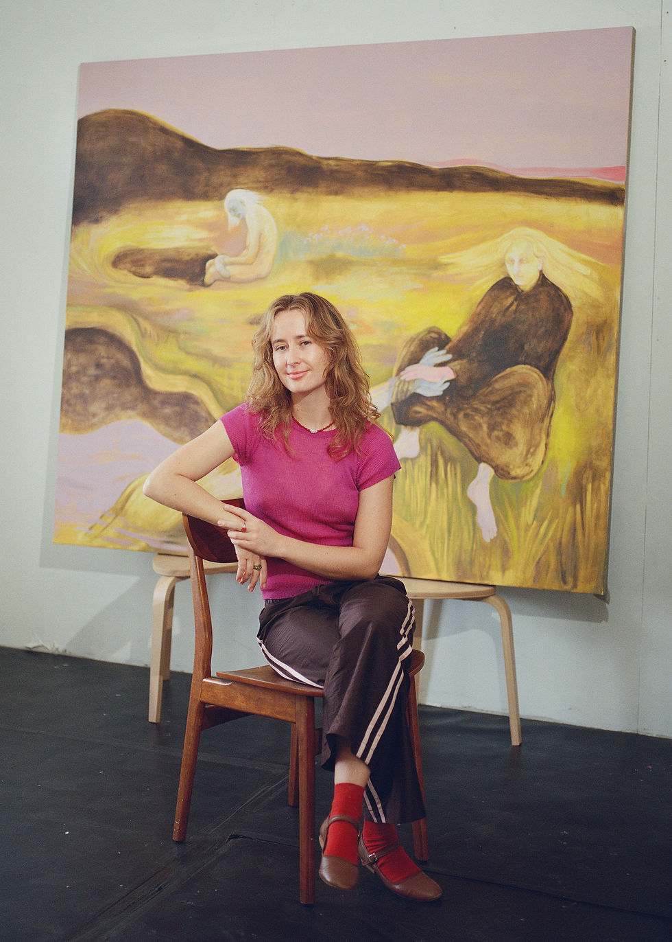
Christopher Griffith
- May 15
- 5 min read
Christopher Griffith is a self-taught painter based in the Hudson Valley, New York. He trained as a research geneticist, dropped out of his PhD in London to shoot for VOGUE in Paris, spent years in fashion and advertising photography, published four monographs, then closed his New York studio and moved to a farm upstate. He started painting during Covid. His series FOURPLAY uses a font he designed himself to hide four-letter words inside geometric abstraction. A mergers lawyer in New York collected the word C*NT to hang in her office, visible during Zoom calls. He has not picked up a camera in over five years.

Q: You're a self-taught artist who started out in genetics. How did you end up painting?
A: When studying at McGill in Montreal, I fell in with a group of misfit artists, lived with a painter, and unknowingly planted seeds for transitioning into the arts. I went on to a postgrad in genetics in London, where I was not so secretly doing photo shoots for BLITZ magazine in my spare time, ultimately dropped out, moved to Paris, and got a highly unanticipated break shooting for VOGUE. After 7 years working in fashion, I moved to NYC, embarked on a Trans-American pilgrimage in an RV, resulting in the monograph STATES, shifting my career into global advertising. In 2018, I closed my studio, moved to upstate NY in order to unpack unfulfilled creative ideas, resulting in taking a series of unconventional funeral flower motifs to a group show during the Venice Biennale. Then COVID struck. I knew we were in for the long haul and decided to start painting.
Q: Before painting, you published four photography monographs. Is that a closed chapter, or does it still run through what you do?
A: Ummmmmmm? To be honest, I am not 100% sure, though at the moment, I have zero interest in picking up a camera, nor have I for over 5 years. Which even surprises me. It's odd, I feel that painting is the culmination of many aspects of my past. It is experimental, like science. It is hands-on, like the renovating of multiple houses over the years, and my painting is highly redacted and graphic, exactly like my photography. All of these things have directly impacted how I see and create work. I love being in my head, the solitude, and the physicality of the making. It's bliss. I only wish I had come to it sooner.… and at the risk of being confrontational, I now get why many artists feel photography is its own category that lies outside of fine art. They are just not the same animal.
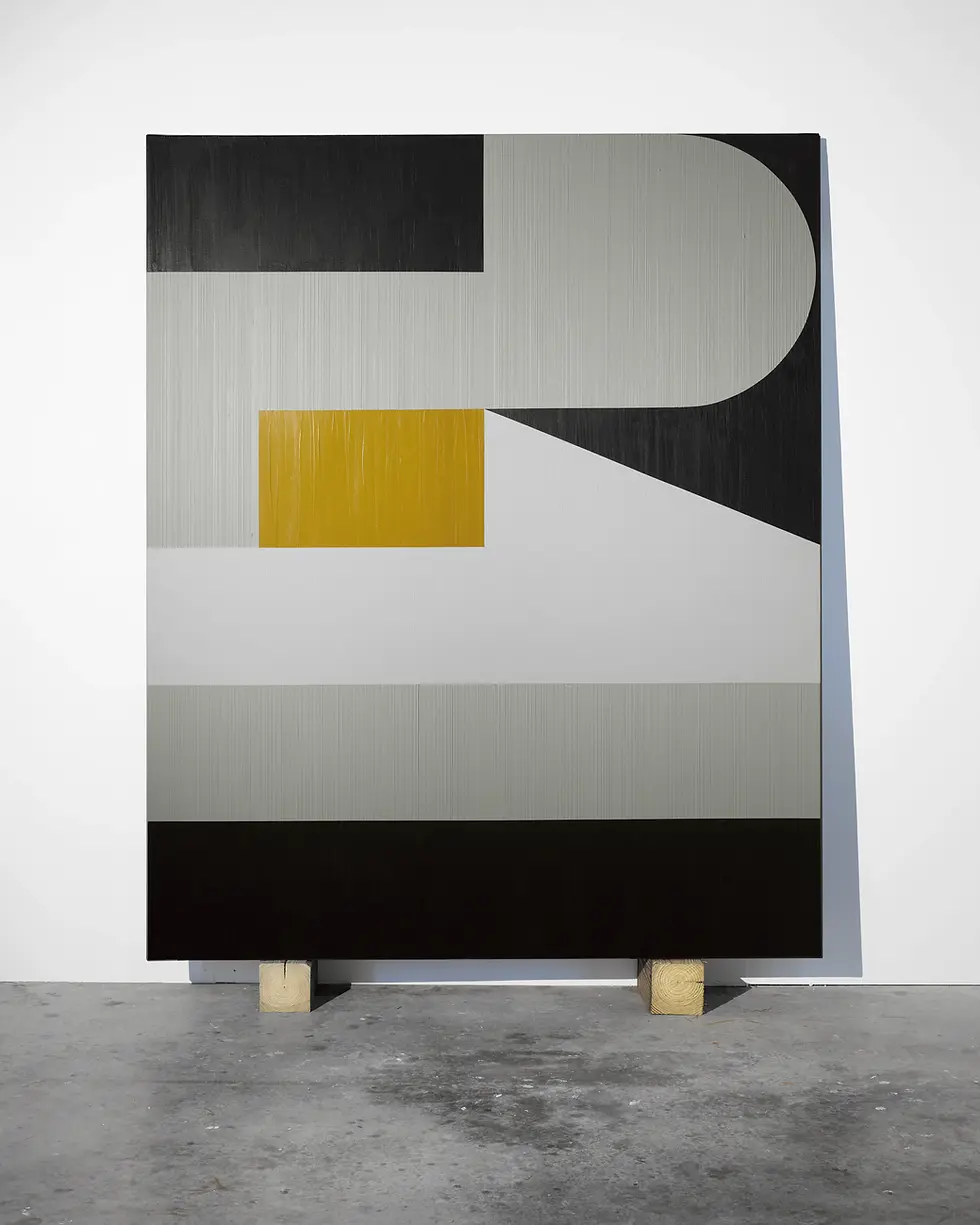
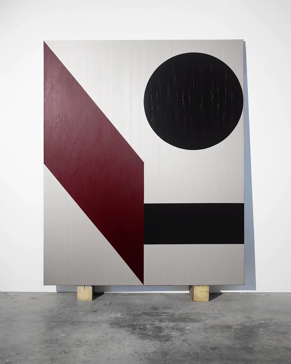
Q: FOURPLAY hides words inside geometric abstraction. Does it matter to you if people figure out the word?
A: I wish I could definitively answer this question. It's yes, but then again no. I think first and foremost, each piece needs to work as a visual construct, and it has been argued by some that this is all that matters. That said, I feel that the riddle hidden within, once fully visualized, gives a layer of engagement that goes beyond graphic abstraction. Meaning is left intentionally vague, with the desire that the viewer creates context based on their own history and experience. A lovely mergers lawyer for a significant firm in NYC collected the word C*NT to hang in her office, clearly visible during Zoom calls. She was utterly delighted that it would silently empower her space as she systematically schooled the boys trying to mansplain. She is my favorite collector ever. So, does it matter that people see it? Yes, but maybe not everyone.

Q: You mention Wool, Indiana, Kelly, Riley, Herrera as touchpoints. Who matters to you most right now?
A: All. I have taken influence from each of them. They are part of the process that led me here. The idea for this series came when I was studying abstract painters from the 1960s–80s. I was initially drawn to the balanced quadrant design of FOOL and LOVE by Wool and Indiana, respectively, but was dumbfounded that they collectively explored maybe a dozen of the 5000+ 4-letter words in the English language. I thought there might be an untapped space and spent months designing a highly redacted font that facilitated spatial interactions that created abstractions not characteristic of my mentors. It was then that the color blocking of Kelly and Herrera (and recently Suzan Frecon) influenced how these constructs would be created. Unlike these artists, my work employs heavy impasto textures, so presently I am exploring the likes of Serra and Soulages in their presentation of textures in paint.
Q: You showed IN MEMORIAM at Venice in 2019 and the reviews were polarised. What did that experience do for you?
A: Inspired by an overheard conversation of an older woman in a car park in Queens, smoking a cigarette at a wake... “But you know, he was a fucking abusive asshole”. IN MEMORIAM is a contentious series of funeral flower motifs that depict the most heinous of human attributes that define some peoples’ legacy long after the false sentimentality is over. I took a Christian cross motif with the word PEDOPHILE and a Star of David in the Israeli flag colors with the word HYPOCRITE to a group show during the Biennale.
Some thought it was amazing, some thought it brave, some thought it ill-advised, some thought it not art and tried to get it taken down. I think it solidified my belief that not everyone will, nor necessarily should, love what you are producing. If you are making work that is not wallpaper, some people might take issue with it. Perfect.

Q: Where is FOURPLAY heading from here?
A: It's pretty early days. I have been painting this series for just over 4 years and have made a small dent in the sheer number of potential paintings. I have sketched several hundred different abstractions, with the possibility of multiple constructs for each word defined by altered color blocking and/or the differential fusing of positive & negative spaces between letters. In other words, the road is long, not to mention an inkling to create some of these in 3-dimensional forms. However, I have recently been creating a side hustle series where I am using the same redacted font as a tool for abstraction, but abandoning the necessity for the final execution representing a word. Its working title is GIBBERISH. Most appear to be acronyms. The first was ANVN. It is titled Archives Nationales du VietNam or Artificial NeuroVascular Network. Stay tuned.