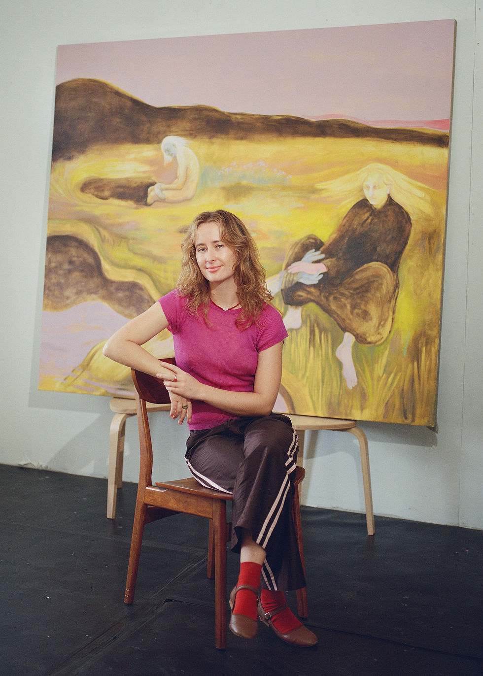
Constantin Schlachter
- Jun 26, 2025
- 5 min read
Constantin Schlachter is a French artist working between photography and painting, often combining the two in unexpected ways. He builds his own tools and skips the camera entirely, painting images by hand and using them as negatives in the darkroom. His recent series, "Nigredo", starts with small watercolours that are transformed into large-scale prints, where colours and light shift through the printing process. The works feel quiet and introspective, created through a method that’s as much about time and material as it is about image.

Q: What made you move away from using a camera and start working directly with light, paper, and chemistry?
A: My first work, "The Gyrovagi’s Trajectory", was produced with different cameras such as digital, analog, and microscope. At that time, I mainly worked in digital, but in 2021 I started to print my pictures in the darkroom, in color and black and white. I felt the need to step away from digital processes in order to reconnect with the material origin of photography — its matrix: light, chemistry, and paper.
While printing, I have to be in total darkness, or in a reddish atmosphere, depending on whether I work with chromogenic or black and white paper. This calming ambiance, plus the time it takes for the picture to reveal itself, gives a particular mood to the printing session — almost meditative.
This analog practice allows the unpredictable to happen freely and lets the imagination wander more intuitively and instinctively.


Q: In "Nigredo," you mix painting with darkroom techniques. How did that approach come about, and what do you enjoy about it?
A: I used to paint for myself, to let my emotions flow without any specific intentions, to clarify my mind. At some point, I did not have the inspiration to shoot anything, but I felt the need to print and to spend time in the darkroom experimenting and searching for colors.
That is how I tried to work with a painted paper in the enlarger instead of a negative.
This technique is close to cliché-verre, also known as the glass print technique. It is a type of "semi-photographic" printmaking. An image is created by various means on a transparent surface, then placed on light-sensitive paper before exposing it to light.
In my project, the paper is put directly into the enlarger, allowing me to play with the scale of the painting and giving me the possibility to add colored gels between the photo paper and the enlarger to partially influence the colors of the prints.
I particularly enjoy these different manual aspects: finding the right paper-paint combination, the right printing timing, and discovering what color spectrum each paint permits. The transparency and materiality (cotton or cellulose) of the paper and paint also play a role in the result.
Lastly, there is the negative aspect that has to be kept in mind in the cliché-verre technique, especially when it comes to color. Indeed, in analog printing you use a negative to obtain a positive picture. It works exactly the same with the paper and pigments: white becomes black, red becomes cyan, blue becomes yellow, and magenta becomes green.
After several attempts, I was able to control the result in some ways, but there is always something unpredictable, as I work with natural elements at first (pigments, paper, and water).
Q: You’ve mentioned the idea of stepping back during the process. How do you find the balance between controlling the work and letting it lead?
A: Control feels unnatural to me. What matters is the impulse and intention you infuse in the work. During the creation of the matrix (the painting in watercolors), I free my mind as much as possible. This part allows me to step back from any control, in the sense that when I paint I do not have something precise in mind — I let the brushes flow.
I used to paint quickly and compulsively. The use of a small format (10x12 cm) surface facilitates that. Also, watercolor does not allow you to correct and redo, as it leaves traces and marks on the paper.
In the end, I paint a lot, “to let go of the good and bad,” in order to edit what I like. I paint mainly simple shapes (circle, square) with gradients or color shades. I select the painting based on my feelings about it and how I imagine the result with the color and density inversions.
Only a few paintings are printed. That is the step where I control the final result. During the printing session, I can adjust the atmosphere of the picture: general density or color temperature. Sometimes I add some color gels between the lens and the photo paper to add color shapes and variations to the result.
To sum up, this project is not created from a specific will or in search of a particular result. It is about attempts, failure, and the acceptance of surprise.
I control how I make the pictures and their editing, but I accept and trust the feelings that brought the pictures and their interpretations to life — without searching for explanations.
Lastly, I think discoveries might happen through mistakes. Often it is the blunder that opens new perspectives, not the effort.

Q: Some of your images feel wide and open, almost like landscapes or skies. How do you think about scale and space when you’re working?
A: The way abstraction — by removing the subject from its original context — can evoke both micro and macrocosm at the same time plays an important role in my practice.
This question of scale has been linked to my work since the beginning.
I like to play with the viewer's feelings, giving the sensation that they are looking at something completely different from what I originally shot. I believe you can let your imagination travel worlds with just a few inputs.
Our soul is a world of retreat, an infinite landscape to wander in. The verses of William Blake in Auguries of Innocence sum up well my vision:
To see a world in a grain of sand
And a heaven in a wild flower,
Hold infinity in the palm of your hand
And eternity in an hour.
In "Nigredo", a change of color appears due to the printing technique I use, and this accentuates the cosmic feeling. Indeed, the faded and light colors of the watercolors become more vivid and deep.
Recently, I’ve explored macro photography and used the enlarger’s magnification to reveal hidden forms — details invisible to the naked eye.

Q: Nature and emotion both seem to play a role in your work. How do they come together for you?
A: Nature and emotion are intrinsically linked. I was born in a small town called Altkirch, in Elsass, France, surrounded by forest and mountains. There I learned gardening and hiking with my grandmother.
Nature replaces words with sensations — it comforts our emotions in a silent, universal language. It brings those unspeakable feelings that everybody translates in their own way. My work should be perceived like this: without further explanations, just sensations.
Q: Contemplation feels central to your practice. What does it mean to you—while making the work, and when others are looking at it?
A: It is central, in the sense that it is important for me to be in the present while I am creating. I practice meditation to help me abstract myself from my surroundings, in order to let go and enter my own inner world. I take my soul as a space to retreat.
By means of that, I invite the viewer to approach my work the same way — with open-mindedness. I invite the viewer to let colors and textures blend with their inner world — to feel rather than to interpret.